


Knowing where our time is really going is essential to becoming more productive. But whilst we can have all the data in the world, without visualizing it tangibly it can only do so much. Being able to intuitively see where your time goes can help you reframe how you want to use it: it can allow you to measure and monitor the impact of any changes you introduce, and stay conscious and in control of your most valuable resource. Here are a few useful time management charts (and the tools that make creating them a doddle) to get started – and not a sad Excel graph in sight.
5 time management charts and where to make them
1. Visualize the spread of work time
Timely has a bunch of customizable time management charts that help to visualize the spread of work time – from the time you spend on individual tasks, to how you distribute effort across clients and projects. With Timely’s useful tags, you can pretty much categorize anything you want to report on, including time in meetings and communication, time by activity or project phases, and time on billable and internal work. Its simple chart builder then lets you transform that data into your choice of different time management charts.
The bar chart is ideal for visualizing logged hours over time – and you can adjust the scale of the chart by day, week, month, or year, and add a median line to visualize the average. The donut chart is good for visualizing money or hours by client or project, and the chart colors are based on your project colors, making things even clearer. The table chart provides the most effective view of your data, but you can easily flick through the different visualizations depending on which time data you want to analyze in the moment.

2. Visualize how much time you’re wasting
Smart decision-making requires accurate data – and sometimes it isn’t until we’re able to really grasp just how much time we’re frittering away that we’re able to act, and reveal new levels of cognitive performance. If you want to be able to visualize how much time you’re wasting on daily distractions, which apps dominate your focus or how often you switch context in a day, you can't beat Dewo.
Dewo’s time management charts reveal insights about the way you work that you may not be conscious of. It follows everything you work on in the background and uses AI to translate the abstract concepts of focus and productivity into clear, measurable units. You can use the Trends section of the tool to examine your email and Slack communications drain, reveal how long you actually spend on productive deep work, and review how much time you spend in different tools. It even quantifies your daily context switching cost, shining a light on the behaviors that fragment your focus. By holding up a mirror to your time management, Dewo provides actionable insights to help you make real change.

3. Visualize to-do list burn rate
There’s something uniquely satisfying in ploughing through your to-do list and knowing you’re getting lots done – but it’s easy to lose sight of the bigger picture. Not all tasks are made equal, and ticking off a whole bunch of small tasks won’t necessarily bring you much closer to your larger, overarching goals. That’s why the Productivity view in Todoist is the ideal place to review your completed tasks and track how your’re progressing against your bigger goals.
When you use the Productivity view, you can easily visualize how many tasks you’re completing on a day-to-day and weekly basis, how much progress you’re making towards your daily and weekly goals, and which projects you’re spending most of your time on. You can also check out your Karma rating, which is Todoist’s point system that rewards you for hitting your goals, and can be a fun way to keep you motivated to complete that extra task before you clock off for the day.

4. Visualize all time spent on devices
In today’s digital world, it can be unsettling to think about how much time we’re spending in front of a screen. Many of us massively underestimate the amount of time we spend each day on our devices, and if we want to make a change, sometimes we need the cold, hard evidence in front us. The good news is that these days there are lots of tools and apps that visualize all the time we’re spending on our devices, and can prompt us to be more intentional with all the ways we use tech.
For Android users, there’s Digital Wellbeing, which gives you a daily view of how often you check your phone and use different apps – much like Screen Time on iOS. Once you have this data, you’ll have a much better understanding of your overall tech use, and can set limits with daily app timers. For an alternative tool available on both platforms, check out Moment, which uses screen-time tracking to create simple, easy-to-understand time management charts that reveal your habits and help you reduce your phone usage. Armed with the knowledge that these tools provide, you can create new, healthy habits and manage the time you spend on your devices.
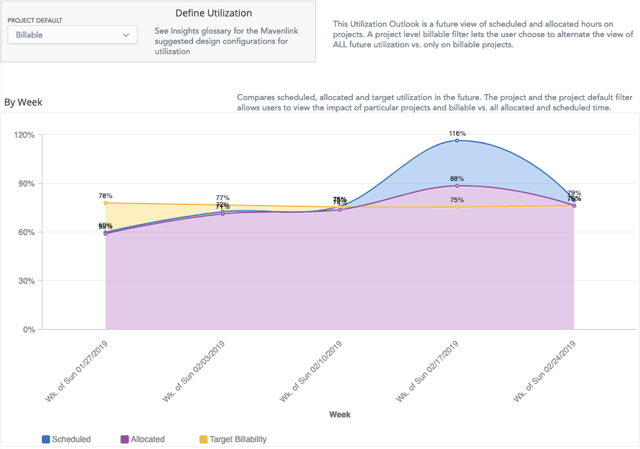
5. Visualize your capacity and billable rate
Understanding how many hours you put in each day at work is critical for sticking to your contracted hours and avoiding burnout. Equally, understanding the billable content of those hours is useful for a whole host of reasons. Many companies use utilization rates – the number of billable hours worked divided by the number of hours in a day – to gauge profitability and performance, and those who work in law firms will be familiar with the pressure to meet billable targets.
As such, it’s in every professional service team’s interest to keep an accurate grasp on capacity and billable percentage at all times. Mavenlink’s standard Utilization dashboard can help here, giving you complete visibility over your capacity and billable performance. By seeing how many billable hours you put in each day, you can gain a good idea of your baseline and what you can reasonably achieve – which is especially important for challenging unhealthy expectations around your productivity.
Equally, by following how many hours you actually put in each day, you can protect yourself against overworking and document any overtime to ensure fair compensation. If you can’t justify a Mavenlink subscription cost, Timely can again pitch in here. Using a color-graded system, it provides a simple visual overview of the work hours you put in each day against your weekly capacity, highlighting any overtime and breaking down your billable to non-billable ratio.
